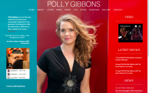
Last week we launched Polly Gibbons new website, and we’re really pleased with the results.
Whilst most people know us for web hosting, and custom programming / automation we still do a fair amount of design work.
The Design Brief
Polly’s team approached us some months ago with an idea in mind for how they wanted the new website to look. Much of the content was already in WordPress, so this would be largely a new theme (for those who don’t know when we design a theme we just change the look and feel of your site, not necessarily the content) with some additional plugins and functionality.
The brief was for large background images of Polly with the content surrounding the images, whilst giving the images and the content room to breathe.
The results
The sort of images required for a design like this are not your normal photographs, you need uncropped images with large areas of unused space (the sort you’d normally zoom out or crop in post production). Polly and her team set about getting new images taken in this style so we could start producing the desktop templates, each page was very dependent on the image used.
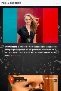
It was clear from early on, that these large images wouldn’t work in a responsive fashion, so a background image was created for smaller screens to use, and on those pages we would inject smaller (both in size and file size) images to add some colour to the design.
We hope you like the results!


Leave a Reply